


Custom Analytics: Enterprise Analytics for Social Media Managers
THE PROBLEM
Social media managers using Custom Analytics need to answer one core question fast: "Is my strategy working, and where?"
Our existing Custom Analytics experience made that harder than it should have been in many ways:
-
Fragmented views: It was hard to parse through the existing data to see how each platform itself was performing.
-
Redundant, noisy charts: Engagement rate on our current Custom Analytics experience was spread across five separate graphs, forcing users to mentally stitch data together instead of seeing the trend.
-
Confusing controls. Filtering, especially comparison filtering, wasn't intuitive to find or use, adding friction to the very first step of any analysis.
Our current Custom Analytics feature had a lot of friction which was undermining trust in the tool itself.
Where the problem came from: The original Custom Analytics dashboard was built under a fast, ship-first timeline with limited design oversight. That speed served its purpose at the time, getting a valuable feature into customers' hands, but it also meant the dashboard was built reactively, one addition at a time, rather than from a single, coherent, well-thought-out place.
SOLUTION
Streamlined social strategy reporting with consolidated cross-profile analytics and clear high-level graphs.
With the redesigned Custom Analytics, social media managers can now view their most valuable insights across all their connected profiles. This new experience allows them to get a high level overview of engagement patterns and growth metrics, as well as drill down into top-performing content.
These insights gained from this dashboard help social media managers demonstrate the impact of their social strategy when reporting to stakeholders or clients. The dashboard turns raw performance data into clear, actionable evidence of value, making it easier for users to justify strategic decisions to leadership and lock in continued investment for their social media efforts.

RESEARCH & SCOPING
From user research sessions, meetings with my PM and technical lead, and through my own UX analyses, these were the areas we scoped and identified to improve from the old Custom Analytics dashboard:

1. Filters Improvements
-
Reorganized the filter bar.
-
Renamed confusing filters.
-
Broke "Compare To" out into its own dedicated spot, making comparison (a core use case) immediately discoverable instead of buried in a general filter menu.

2. Platform Snapshot Improvements
-
Added a snapshot by platform section where users get an at-a-glance view of followers, engagements, views, and engagement rates by platform.
-
Reordered the KPI tiles based on user feedback.
-
Made it more clear to view the metric change over time per KPI.

3. Trends Graphs
This was the core of the redesign. I made these changes:
-
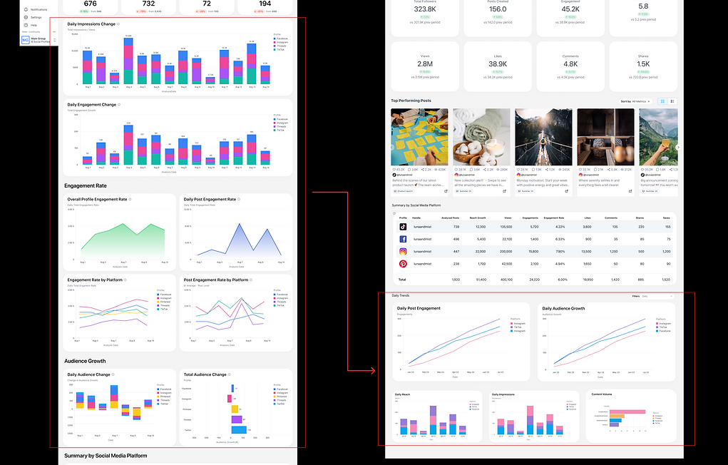
Took an engagement rate section that was sprawled into five separate graphs and consolidated it into one single post engagement graph.
-
Consolidated Audience Growth into one graph from a scattered set of charts.
-
Added three new views users had been asking for: Daily Reach, Daily Impressions, and Content Volume by platform.
-
Added a filter to the graphs section, letting users view data by day (daily), by week (weekly), or by month (monthly).
4. Additional Improvements
-
Added in a Top Performing Posts section to allow users to drill into their posts that were performing well. This gave users the ability to see a zoomed in view of their posts that were performing the best, on top of being able to see a holistic view of their data.

IMPACT
-
Shipped to 100% of Scale-tier users (customers with Custom Analytics access) on May 21, 2026.
-
Reduced the engagement rate view from 5 graphs to 1, cutting visual noise without losing analytical depth.
-
Positioned as a key re-engagement driver for existing customers and a credibility signal for prospects, reinforcing that Later "takes reporting seriously".
-
Laid the design foundation for paid data integration (Meta Business ads), the next phase of Custom Analytics: letting users compare organic vs. paid performance in one place.
REFLECTIONS & NEXT PHASE
You can find the final solution prototype of this dashboard here.
The hardest part of this project wasn't adding anything, it was deciding what to remove. In order to decide that, I had to deduce if every existing chart served some sort of pre-existing reason, or if it didn't. So simplifying meant going back to first principles: what decision is this user actually trying to make, and what's the minimum data that supports it?
The next phase of this project is already underway, which is adding paid ad data onto this dashboard, and I am taking the same lens I used to view this project's problems to this next phase of this work. Stay tuned for a case study on that dashboard work!
