


Hikr
Simplifying the process of discovering and saving interesting hikes.
Responsible for:
Ideation, UI, UX, User Testing, Wireframes, Prototyping
Tools:
Sketch, Principle, Photoshop, Pen & Paper
The Problem
As an avid hiker, I see Vancouver as a great place to get outdoors. However, when planning a group hike, it's difficult to get information on hikes quickly and efficiently, while making sure the hike is the right difficulty level, the view is worth it, and the trail itself isn't too crowded.
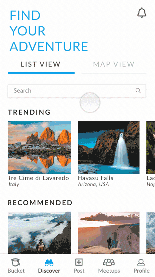
Hikr provides a simple solution, a hiking app with an emphasis on photos so you can know for sure what view to expect, as well as easy to read trail information to help make the hike research process smoother.
The Solution


THE PROCESS
Background Research
To start, I compiled a list of already existing resources and apps for hikers. I ordered this list from the resources I personally found most useful, to resources that seemed the least useful; beginning of the list = most useful, end of list = least useful.

What I deduced from this list was that there were a great deal of apps out there aimed to help hikers, but they all operated about the same, and all contained a great deal of information which I wasn't sure was entirely necessary. Onto my next step!
Preliminary User Testing
To determine what users really deemed important and necessary when undergoing their hiking process, I conducted 10 in-person interviews.
Some questions I asked were:
-
Tell me about your process of how you choose a hike to do/prepare for a hike. What is the easiest part of this process? What is the most challenging part of this process?
-
What motivates you to go hiking/to not go hiking?
-
What information do you usually gather before going on a hike?
-
What resources do you consult before going on a hike?
-
Have you ever had a bad hiking experience? Why was it bad?
-
Have you ever had a good hiking experience? Why was it good?
DATA SYNTHESIS:
Among the users I interviewed, there were 5 male users and 5 female users. All users were in the age range of 18 - 25 years old.
The common frustrations of all the people I surveyed fell into 2 categories:
- Not knowing what hikes friends want to do.
- Seeing hikes posted on Instagram but without a location tag; don't know what these hikes are but wanting to know.
- Not remembering all the hikes they have done, when they want to recommend good hikes to friends.
- Not having one place where they can save and share all their favourite hikes.
Social Frustrations
Preparation Frustrations
- Not knowing an accurate difficulty of a hike.
- Not knowing the location of a hike's trailhead.
- Too much time spent navigating many different websites to gather information on one hike.
- Not knowing how much water to pack.
Most importantly...
I asked my users what they valued the most when choosing a hike, and these were the top 3 values:
1) Finding a hike with a decent view.
2) Finding a hike that is challenging enough.
3) Choosing a hike that isn't crowded.
USER PERSONAS:
From my preliminary user testing, I now had 2 personas. Which one do you relate more to?
Harris is visually motivated, enticed by what he can see on hikes. Lorraine is a busier individual, looking to make the most out of her time. Both users state one of their top motivations to go hiking is to enjoy a beautiful view; Harris wants to enjoy this view through photographing it and creating memories, Lorraine wants to enjoy this view through challenging herself on a strenuous to moderately strenuous hike. These are all things I will keep in mind as I design this app!


Defining the Problem
From preliminary user testing, I had identified a few problems to address. But which to focus on?
After some evaluation on what was solvable, while keeping in mind what was feasible, and also prioritizing my top 3 values from my users, I decided to focus on the "choosing a hike" and "saving a hike" part of the whole hiking process. My design challenge was now to simplify the process of discovering and saving a hike, while still providing the minimal, most valuable information that my users wanted to know before settling on a hike to do.
User Flow
I now had my problem, and the users who I was designing for. My next step in my process was to figure out what my users' current workflows looked like, when looking for and saving hikes.

Some super rough workflow sketches of both users
After some careful thinking and analyses of my users' current workflows, I had some great information on how my users normally searched for and chose hikes to do! I could also identify certain areas in the current workflow that my users had frustrations with (for example, one of the most common frustrations was spending too much time trying to obtain information on a hike). Keeping this in mind, I designed a user flow for my app's MVP following the same flow my users normally used, in order to help this app integrate seamlessly into my users' current process. This was because, as we all know, users don't like to deviate far from the way they normally do things.
Allowing the users to do what they normally do without introducing a huge behavioural change, and also eliminating their pain points in this process, allows users to achieve the highest level of emotional design with this app; reflective design. Viewing this app as an extension of their ability to enjoy themselves outdoors and express themselves as an outdoorsy, creative, active person shows this reflective level of emotional design the user has with this app.

The user flow of my MVP
Now that I had my user flows, I created a journey map of navigating through the MVP from my two user's perspectives, to get a sense of both my user's emotions, motivations, pain points, and high points as they progressed through Hikr. Click on the images below to enlarge them!

The journey map of Harris Lo

The journey map of Lorraine Mak
Sketches and Wireframes
Now onto the good stuff! I had my workflows, I had my users figured out, now it was time for some simple wireframe sketches. I started out with some rough sketches, because sketching is the fastest way I can get ideas down before turning my wireframes into more high fidelity designs.

My rough wireframe sketches
Mockups and Prototypes

User Testing, Iterations and Findings
The one feature I focused on in my user testing were the "Add to Bucket" and "Mark Accomplished" buttons, as well as the "Join Meetup" action. I was trying to find the best ways to display these actions on a hike's screen.
I tested these actions with 6 potential users, 4 male, and 2 female. Below are the screens I tested with users, as well as the feedback I got on each screen.
DROPDOWN MENU 1

-
"Not sure what clicking the menu will show me."
-
Unclear, ambiguous.
Feedback:
DROPDOWN MENU 2

Feedback:
-
Also unclear and ambiguous.
-
"Will it show me related trails in the area?".
DROPDOWN MENU 3

-
Not sure what "actions" means.
-
"Will it give me actions to take when hiking this trail."
Feedback:
LARGE BUTTONS 1

LARGE BUTTONS 2

Feedback:
-
Weird that some buttons are blue, and some are white.
-
Looks like 2 buttons are clicked, and one is not.
-
Blue is overwhelming.
-
The options are clear.
Feedback:
-
It's clear but the buttons are a bit too large.
-
Too much emphasis on the buttons.
BUTTONS 1

BUTTONS 2

Feedback:
-
A bit annoying to not know where to join a meetup.
-
Not intuitive to know where to join a meetup.
-
Buttons are clear.
Feedback:
-
2 buttons look clicked, one does not.
-
Weird that one button is an icon and the other ones are words.
OVERALL RESULTS:
GENERAL:
TRAIL PAGE:
-
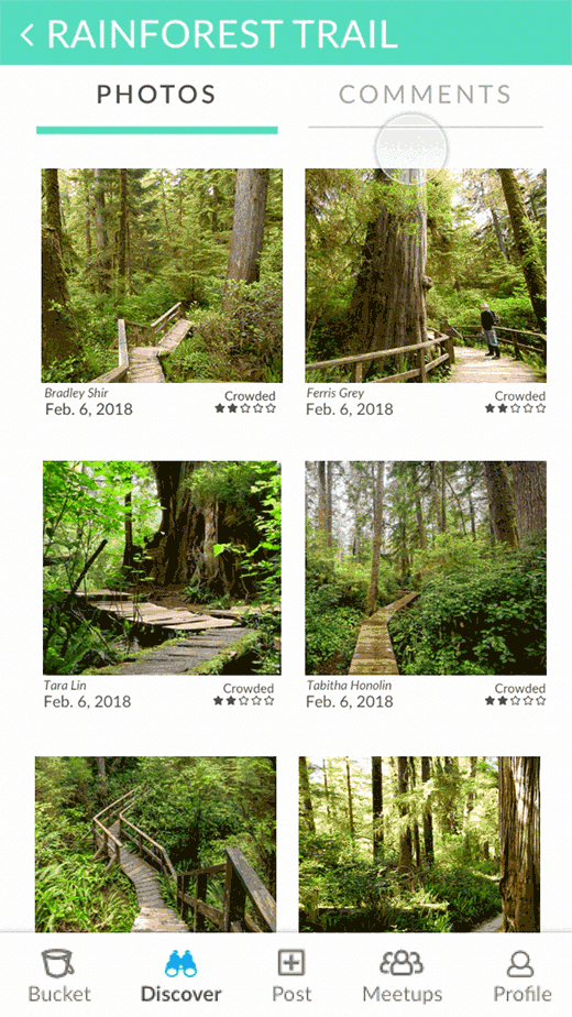
Like the crowded rating of hikes.
-
Allow map to expand when clicked upon.
-
Like the comments section.
-
Would be nice to have the "Join Meetups" action on the trail page.
-
Home page is very engaging.
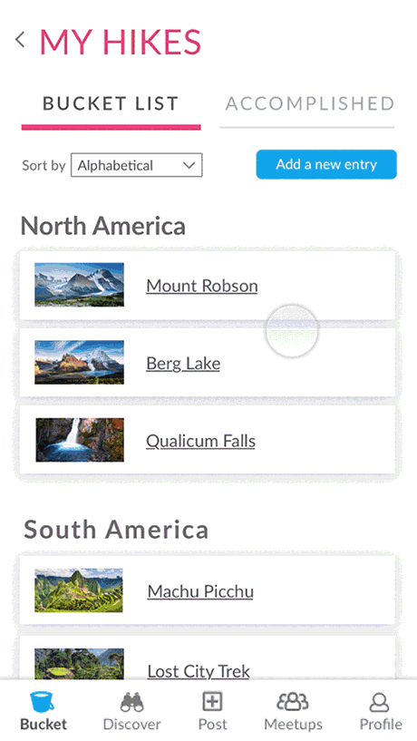
BUCKET LIST:
-
Generate options to allow users to categorize their bucket list.
Taking all of this feedback into account, I made several changes to improve the functionality of my app:
-
Allowed users to categorize their bucket list, a providing a list of options of how they could do that.
-
Keeping the "Join Meetups" on the trail page.
-
Adding words on the bottom navigation.
-
Allowing the map to be expanded when clicking on it.
-
Fixing general formatting.
Looking Forward
Now that we have these screens and workflows, I have mapped out a journey through the entirety of my app for future use and future design. Check it out below!
.png)
All the actions you can perform on Hikr!
A Reflection
I did this project over the course of the 4 month summer break, while working a full-time job. Undergoing this project in the summer was quite a lengthy process, as I juggled time between my job, this project, and personally doing hikes (I love to hike!). Nevertheless, this was an extremely fun, rewarding project to have undertaken, and I learned a lot about both the UX process and myself, and became a better designer through it all. I learned to have a more critical eye when designing features on an app, and learned to question everything, why I was putting a button in one place vs. another, if something on the page was truly necessary, etc. I love the process of creating your own project, and making it your own while designing it to be functional and useful for your users. On my path of continuous growth, I will continue to do projects like this, and know that there will always be more to learn as I keep moving forward.
Thanks for reading!